
Reading charts may seem a bit mystic, and you may prefer to stick to basic long term investing on the basis that the markets , in general, will rise over time. There’s nothing wrong with that approach if that is where you feel comfortable, and you don’t have the time to get involved with the technical indicators.

In this post we will look at the most widely recognised indicator of price movement- The Candlestick.
A Candlestick will have 3 components:
- Body – Range between open price and close price of the interval period
- Wick – Highest price and lowest price
- Colour – Green is price increase i.e. closed the interval period higher than previous. Red is price decrease i.e. closed the interval period lower than previous.

Note: The interval period is just the time scale you are reading your chart. There will be the option to change the ‘interval’. This could be 1min, 10 min, 1 month. If you are viewing the 1 minute interval, a green candlestick shows that the price closed higher than what it was the previous minute.
Basic candlestick shapes
Remember the terms “Bull” and “Bear” – with Bulls, prices will rise, Bears they will fall. Using these two terms we can explain the candle stick shapes in simple terms.
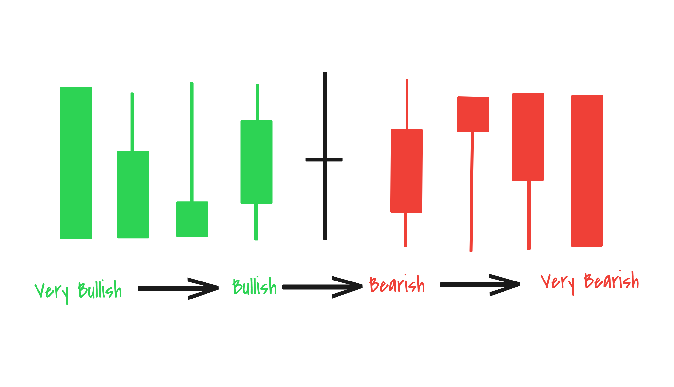
In the diagram above, the solid green candlestick is very bullish. As you move right the candle stick becomes less bullish and eventually becomes increasingly bearish.
Lets look at this on a real chart:
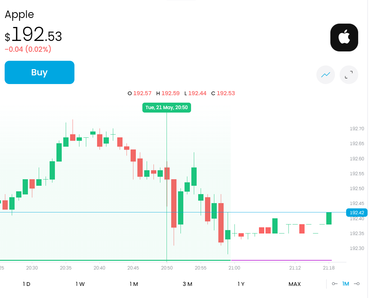
You can see the red candles with downward trend, and the green ones showing upwards trend. Very long candle bodies show a large difference between opening and closing price. Shorter candle bodies mean less price movement.
And it really is that simple. Practice looking at live charts to see the candle stick formations, as investors buy and sell.

Leave a comment